Our Process
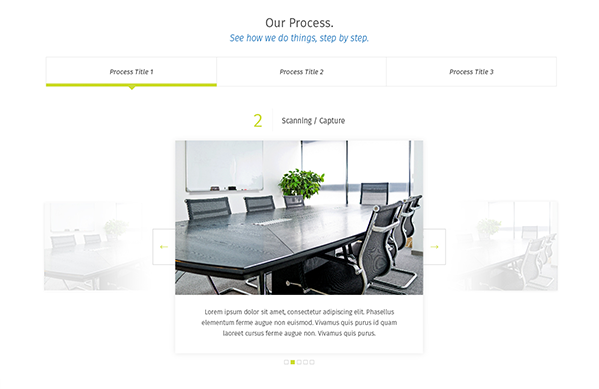
With old-school (paper) businesses often hesitant for radical digital change, we worked to develop an informational carousel that walked potential clients through what to expect for a process going forward.
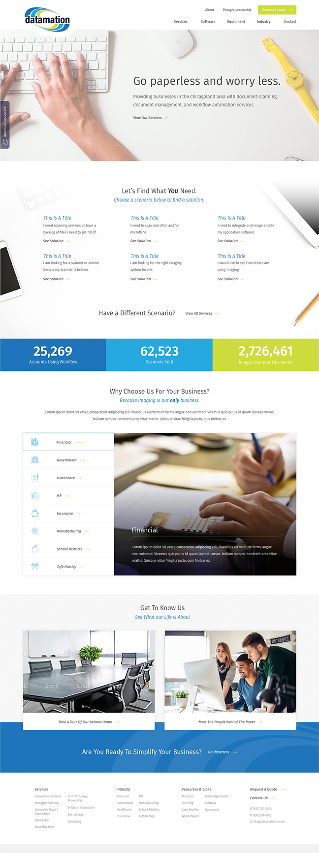
Datamation is a paperless solution provider that helps businesses with smart document scanning, document management and automation solutions. They came to us with the task of tweaking their existing brand, building a new website and pushing marketing efforts in organic and paid arenas.
Taking an outdated color palette and creating a new brand and web experience for clients.
Refreshing the brand colors, creating imagery pairings and highlighting informational advantages that clients receive.
A website that provides clients with the proof they need in order to make an informed decision on whether or not digitizing their back offices is necessary.
The brand refresh helped us to hone in on a color palette that was more suitable for the new digital experience that was being built. In order to achieve this refreshed look we updated the heavy, dark green, purple and grayish palette to a much brighter blue and green variant.

One of the big brand elements we discontinued from the logo and other materials was the outdated use of gradient through colors. This helped to keep a consistent, clean look and bring design into the most recent decade.
Color Refresh
REMOVED GRADIENT
Adding personality to paper isn’t always easy, but that is what we did. We looked to communicate the services and track record of experience while peppering in cultural aspects of the company. Building on top of that was a content initiative that helped to tie a blog, case studies, white papers and resources into a useful thought leadership section.


Numbers and statistics were utilized in various places throughout the site in order to help demystify the confusion surrounding Datamation’s experience in the industry.

With old-school (paper) businesses often hesitant for radical digital change, we worked to develop an informational carousel that walked potential clients through what to expect for a process going forward.

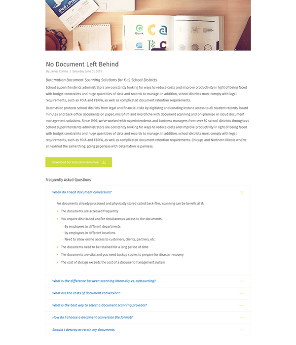
With tons of articles, research and case studies to support the move to a digital presence for your back-office, we worked with Datamation to design out a resource center that clients could access. Special consideration was given to how items were to be tagged and accessed to be edited in the CMS.
The result is a clean, minimal website that allows information, articles and content to be pushed out with ease.
